


Wallpaper: An Interview with Francesca Kletz
Francesca Kletz has never been afraid of colour. From redesigning floor plans as a child with paint cards from Homebase, to creating bold, layered interiors filled with texture and personality, her approach has always been rooted in instinct rather than trends.
In this interview, we talk about the dollhouse project that reignited her creativity, the interiors risks that paid off, and why she believes everyone should embrace at least one “ugly” colour in their home. Alongside her miniature reimagining of Orla Kiely’s iconic Flower Power print, Francesca shares her thoughts on timeless design, maximalism, and creating spaces that genuinely bring joy.
Where did your love of interior design come from?
Francesca: I used to spend hours constructing houses for my Barbies out of books and the layout was so important to me! When I was about 12 I used to walk up to the local Homebase and take all the free colour cards. I’d scroll through estate agent websites, print off my favourite houses and floor plans and then redesign the spaces and make up schemes with the paint samples. I also used to nick my mum's interiors magazines and cut out furniture to add to my schemes. I had no idea I was just making mood boards.

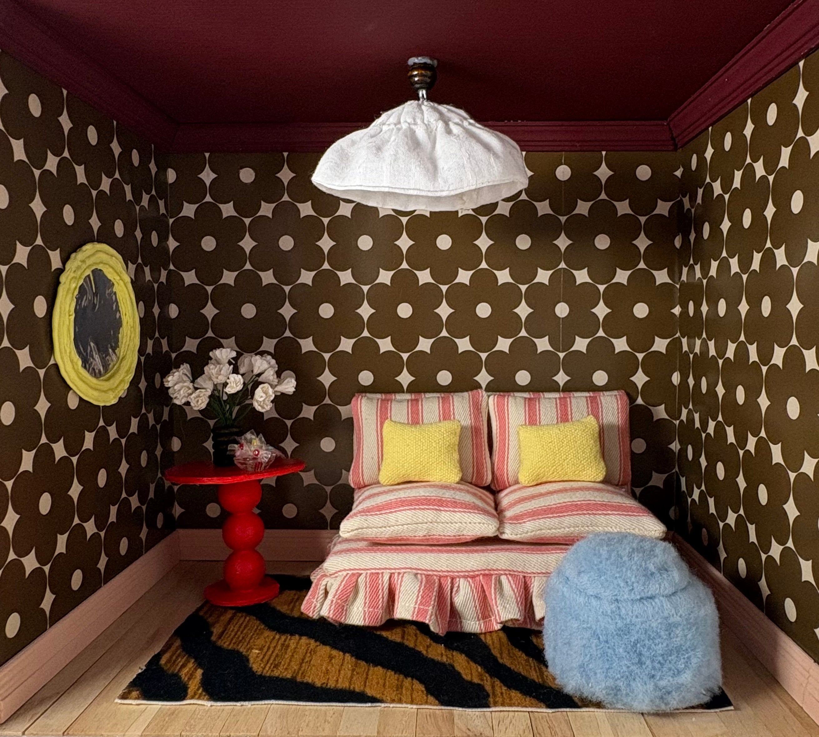
Miniature dressing room using Block Stem Chalky Green Wallpaper
What inspired you to buy the dollhouse, and why did you decide to include one of Orla’s prints within it?
Francesca: I have two small children and live in a flat, so a lot of the updates I’d love to make to my own home are a little out of reach. I was desperate to find a way to explore some interior design ideas I’ve had, away from computers and screens and actually include upholstery and experiment with real texture. One nap time (the baby’s, not mine) it dawned on me that if I had a dollhouse and totally stripped it back, that would scratch my creative itch. It also allows me to go deep into my maximalist fantasy interiors in a way that I wouldn’t necessarily push with a client - but demonstrates how things might look if someone can’t imagine my plan without seeing it. The dollhouse has given me complete creative autonomy on a small, manageable scale.
I have always admired Orla Kiely as a brand that puts bold print at the front and centre. It made perfect sense to collaborate using an Orla print in miniature, so I scaled down the Flower Power wallpaper and experimented with how the bold shapes work with other textures and new palettes.

What tips do you have for people who are nervous about using colour / bold prints in their home?
Francesca: It’s really easy and “safe” to go with greige and I totally understand that people spend a lot of money on their home and are scared they’ll get sick of something too bold. But the reality is is that if you ignore trends and what people tell you is safe and instead you follow your instinct and pick colours and prints you really love then you won’t get sick of it; when I painted my flat entirely baby pink everyone told me I’d get sick of it - but baby pink is my favourite colour! After seven years, the only thing I’m sick of is all the bits I painted white (ceiling, woodwork) because my contractor told me that’s what you’re “meant” to do, I'm here to tell you that it absolutely isn't. In fact the things I did that really horrified him like using red grout in my bathroom are the things that feel the most timeless to me because I followed my instinct instead of rules or trends.
I suggest starting with a small space - a toilet or even a big cupboard and just go really bold with a colour you love and see how you feel - I guarantee you’ll end up sitting in that cupboard every evening because it will bring you so much joy.
The other thing I’d suggest is using paint colours from good quality paint companies - they have done the work to create layered and considered pigments. Sometimes what doesn’t work with really bright colours from cheaper paint companies is that the colour is too saturated and it makes the bright colour look garish rather than eclectic.

Miniature bathroom using Wild Rose Porcini Wallpaper
Have you ever regretted an interior design decision you’ve made?
Francesca: I often think about the final design I did on Interior Design Masters, I know the boxiness of the modern flat threw me as I had decided going into the competition that new builds were my kryptonite; however, what I hadn’t thought through properly was how to use my superpower - textiles - to my advantage in the space. What’s lacking in super contemporary spaces like new build flats is texture and shape and I know now that I should have created an entire wall of floor to ceiling drapes to really bring some life to that space.

When thinking about your interior design process, are there any failsafe tips and tricks you think everyone should know?
Francesca: Sample, sample, sample! There’s a reason why companies provide samples for things! Put paint samples in every corner of the room to see how the light behaves because colours really do look different everywhere. Create a moodboard for each room and try lots of different combinations of colour, fabric, print and texture until you feel really drawn to what you’re looking at - you also might be surprised by what ends up working together.
My other absolute failsafe tip is to always use one ugly colour; think mossy green, muddy brown, taupe, murky yellow and mix them with brighter and cleaner shades - this will elevate your brighter more daring colours. If you love baby pink and baby blue (like me!) you have to use a brown or an olive to ground them otherwise your space will look tacky and babyish instead of sophisticated but fun.
And remember: animal print is a neutral and it might be the thing that brings your room together.
What is your formula for designing a space that you will still love in years to come, or helping others design a space they will still love in years to come?
Francesca: I can live with a lot of print and texture and colour in one space, but that isn’t for everyone. I think the first step is to scroll through Pinterest and interior design magazines and take note of what all the spaces you love have in common - are they all minimalist? Are they all blue? The colours and styles that really sing to you are your perfect starting point. The next step is to really consider what makes that space special; it will almost always come down to layering. Even the most minimalist homes need layers. You need softness as well as cleanness and when you make moodboards that incorporate all of these layering elements (walls, floors, lighting, accessories, art, cushions, etc.!) You can build a layered space that works for you and will keep working for you for years - you will also be able to confidently add to and adapt your space which is essential.
Only buy things you really love and that you know work in your home or that you have a space for. Invest in those lamps and chairs and items that are good quality and beautifully designed and mix them with flea market finds and family pictures in frames that work with your interiors. If you see things you love in your home, you will love being in your home.
What are your favourite Orla Kiely wallpaper prints?
Francesca:There are so many fun wallpaper prints that would work in so many different rooms. I’ve used Flower Power in Cream and Walnut for my miniature Orla room but I also really love Puzzle Flower in Ochre - I think it would look so cool in a bedroom with lots of browns and pinks or in a bathroom with a baby blue loo.

Explore the full range of Orla Kiely wallpaper, and find the style to revamp your home.